from dataidea.packages import plt, sns, np, pdSeaborn Part 2
The Python visualization library Seaborn is based on matplotlib and provides a high-level interface for drawing attractive statistical graphics.
Make use of the following aliases to import the libraries:
The basic steps to creating plots with Seaborn are
- Prepare some data
- Control figure aesthetics
- Plot with Seaborn
- Further customize your plot
tips = sns.load_dataset('tips')tips.head()| total_bill | tip | sex | smoker | day | time | size | |
|---|---|---|---|---|---|---|---|
| 0 | 16.99 | 1.01 | Female | No | Sun | Dinner | 2 |
| 1 | 10.34 | 1.66 | Male | No | Sun | Dinner | 3 |
| 2 | 21.01 | 3.50 | Male | No | Sun | Dinner | 3 |
| 3 | 23.68 | 3.31 | Male | No | Sun | Dinner | 2 |
| 4 | 24.59 | 3.61 | Female | No | Sun | Dinner | 4 |
sns.set_style("whitegrid")g = sns.lmplot(x="tip", y="total_bill", data=tips, aspect=2)
g.set_axis_labels("Tip","Total bill(USD)")
plt.show()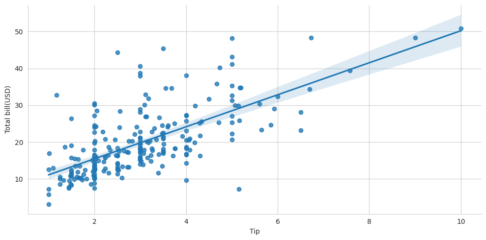
Data
Seaborn also offers built-in data sets:
uniform_data = np.random.rand(10, 12)data = pd.DataFrame({'x':np.arange(1,101),
'y':np.random.normal(0,4,100)})titanic = sns.load_dataset("titanic")
iris = sns.load_dataset("iris")fig, ax = plt.subplots()
Plotting with Seaborn
Axis Grids
# Subplot grid for plotting conditional relationships
g = sns.FacetGrid(titanic, col="survived", row="sex")
g = g.map(plt.hist,"age")
#Draw a categorical plot onto a Facetgrid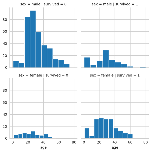
Subplot grid for plotting pairwise relationships
h = sns.PairGrid(iris)
h = h.map(plt.scatter)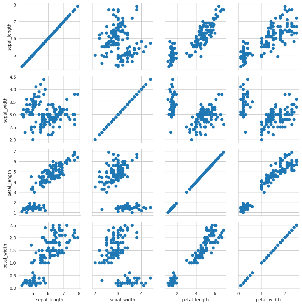
sns.pairplot(iris)
plt.show()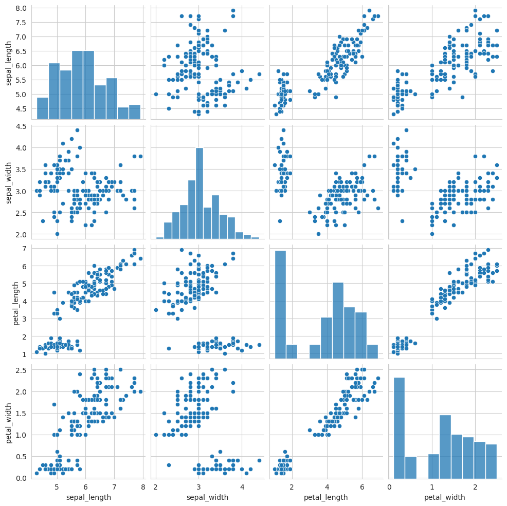
Grid for bivariate plot with marginal univariate plots
i = sns.JointGrid(x="x",
y="y",
data=data)
i = i.plot(sns.regplot,
sns.distplot)
/home/jumashafara/venvs/programming_for_data_science/lib/python3.10/site-packages/seaborn/axisgrid.py:1886: UserWarning:
`distplot` is a deprecated function and will be removed in seaborn v0.14.0.
Please adapt your code to use either `displot` (a figure-level function with
similar flexibility) or `histplot` (an axes-level function for histograms).
For a guide to updating your code to use the new functions, please see
https://gist.github.com/mwaskom/de44147ed2974457ad6372750bbe5751
func(self.x, **orient_kw_x, **kwargs)
/home/jumashafara/venvs/programming_for_data_science/lib/python3.10/site-packages/seaborn/axisgrid.py:1892: UserWarning:
`distplot` is a deprecated function and will be removed in seaborn v0.14.0.
Please adapt your code to use either `displot` (a figure-level function with
similar flexibility) or `histplot` (an axes-level function for histograms).
For a guide to updating your code to use the new functions, please see
https://gist.github.com/mwaskom/de44147ed2974457ad6372750bbe5751
func(self.y, **orient_kw_y, **kwargs)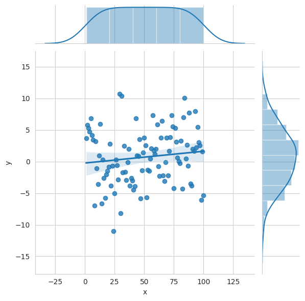
# Plot data and regression model fitsacross a FacetGrid
sns.lmplot(x="sepal_width",
y="sepal_length",
hue="species",
x_ci = 'sd',
data=iris)
plt.show()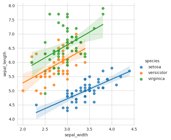
Categorical Plots
Scatterplot
Scatterplot with one categorical variable
sns.stripplot(x="species",
y="petal_length",
data=iris, hue='species')
plt.show()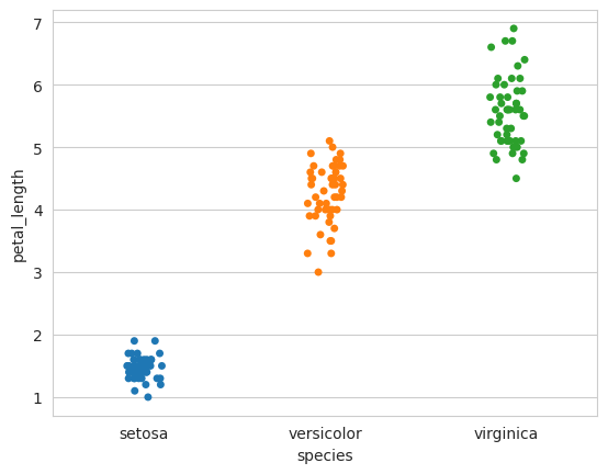
Categorical scatterplot with non-overlapping points
sns.swarmplot(x="species",
y="petal_length",
data=iris, hue='species')
plt.show()
/home/jumashafara/venvs/programming_for_data_science/lib/python3.10/site-packages/seaborn/categorical.py:3399: UserWarning: 12.0% of the points cannot be placed; you may want to decrease the size of the markers or use stripplot.
warnings.warn(msg, UserWarning)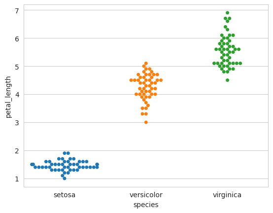
Bar Chart
Show point estimates and confidence intervals with scatterplot glyphs
sns.barplot(x="sex",
y="survived",
hue="class",
data=titanic)
plt.show()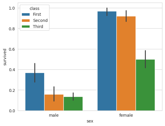
Count Plot
Show count of observations
sns.countplot(
    x="deck",
    data=titanic,
    palette="Greens_d",
    hue='survived')
plt.show()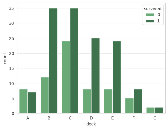
Point Plot
Show point estimates and confidence intervals as rectangular bars
sns.pointplot(x="class", y="survived", hue="sex", data=titanic,
            palette={"male":"g","female":"m"}, markers=["^","o"], linestyles=["-","--"])
plt.show()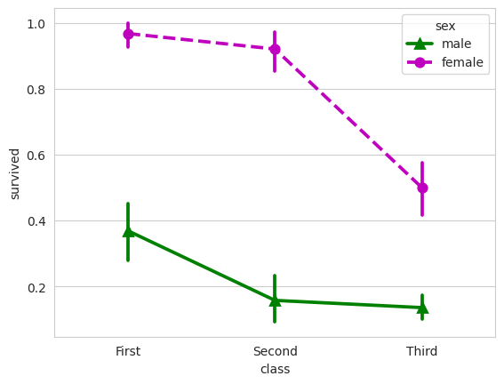
Boxplot
sns.boxplot(x="alive", y="age", hue="adult_male", data=titanic)
plt.show()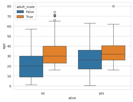
sns.boxplot(data=iris,orient="h")
plt.show()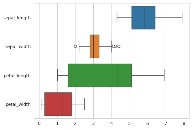
Violin Plot
sns.violinplot(x="age",
y="sex",
hue="survived",
data=titanic)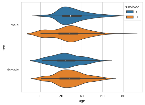
Distribution Plots
Plot univariate distribution
plot = sns.displot(data.y, kde=False, color="b")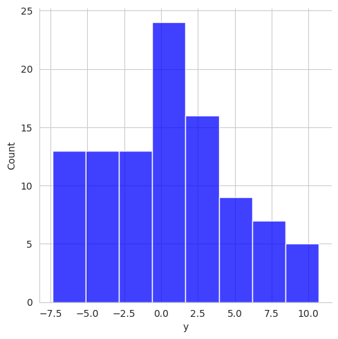
sns.displot(data.y, kde=True, color="b")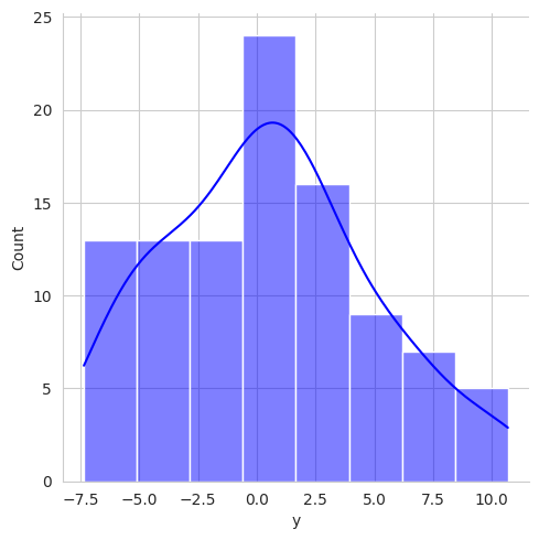
Matrix Plots
Heatmap
# Exclude non-numeric columns from correlation calculation
numeric_cols = tips.select_dtypes(include=['float64', 'int64'])
correlation_matrix = numeric_cols.corr()

# Plotting the heatmap
sns.heatmap(correlation_matrix, annot=True)
plt.title('Correlation Heatmap')
plt.show()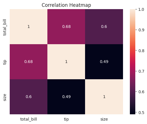
plt.show()
plt.savefig("foo.png")
# You can save a transparent figure
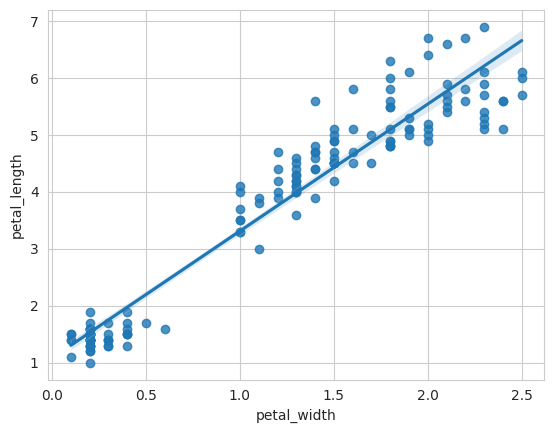
plt.savefig("foo.png", transparent=True)<Figure size 640x480 with 0 Axes>fig3, ax = plt.subplots()
# Create the regression plot
sns.regplot(x="petal_width", y="petal_length", data=iris, ax=ax)
# Display the plot
plt.show()